If you like retail, especially grocery, you are going to love this! If you have a passion for shopper marketing and shoppers in general, this is going to be fun! And if you work in consumer goods, in marketing, sales or trade marketing – check this out now. Because somewhere in this article is the future of retail. Not everything will stick, but this store is so packed full of great shopper-centric thinking, some of this must be part of what comes next for bricks and mortar grocery retail.
The future of retail will require trying new things
I’ve been to so many stores, all around the world. I’ve worked in most categories, and every time I work any project I visit stores. Seeing what is actually going on, seeing what shoppers see, watching what shoppers do. It’s a key part of getting under the skin of a market, a category, and a client, and it is one of my biggest sources of insights (or at least the hypotheses that lead to insights!) So do I get bored sometimes of seeing the same things in stores? Sometimes. I admit it. You travel half way around the world and while the brands might be different, and the language too – a lot of stores look boringly the same. So when I see a store like this one, jam-packed full of ideas – I’m in shopper marketing heaven!
And there are lots of things to share – more than I can hope to do in one article. So I’m going to pick a handful of things here, and then go deep on some of the other areas in subsequent articles and posts. If you don’t already subscribe – you know what to do!
Before we go further, let’s be clear. This store isn’t perfect. Far from it. I’m not holding it up as a world class store. But I love that there are so many clever ideas, some old, some new, all vying for space. And each of them is completely shopper-centric. This is a retailer that is clearly trying to win shoppers hearts and minds, as well as their wallets. This is a retailer that recognizes that the future of retail is more than packets on shelves, discounts and deals.
Also, this is quite a unique retailer too. For those of you who don’t know Marks & Spencer (M&S), it is (at least in the world of food) a little bit upmarket, with (almost) all of their product under their own brand. While this makes it an uncommon model, that doesn’t mean that there isn’t loads for us all to learn from this store about how to reinvent grocery retail for the 21st century shopper. So, enough of the preamble – let’s get on and see the store!
Set up the shopper right from the start
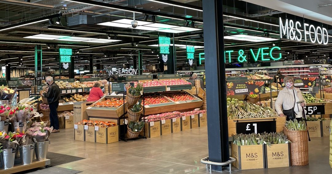
Any store which reflects the future of retail will step away from the current obsession with price, promotion and deals. Check out the image below. This is what greets you when you enter the store. What do you see? As you enter, this store screams ‘food’ and ‘fresh’. Its exciting and uplifting to have food values, rather than discount values as the key message that hits you. Shopper research shows us how important this part of the shopper journey is: this few moments sets the scene for the entire shop. Hit me with deals and discounts, and you tune my mind to deals. Hit me with fresh, enticing food? I’m here to indulge!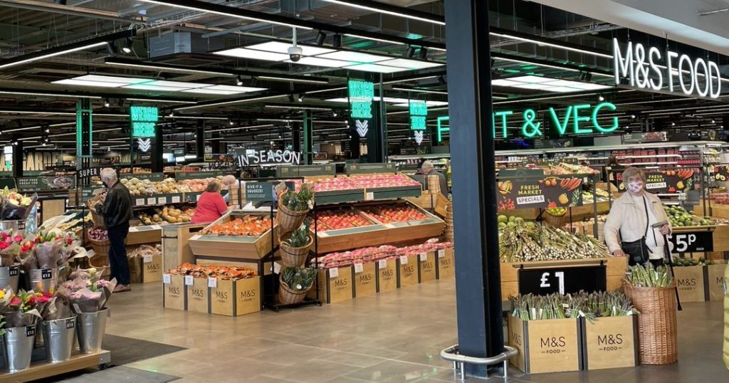
The future of retail needs shopper-centric messaging
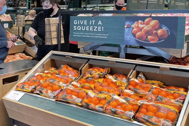
There are some nice touches too with the signage and messaging. Check out this display of oranges: the big words make me immediately think of freshly squeezed juice: driving incremental purchase by highlighting a specific consumption opportunity. And the smaller text goes further, suggesting how orange juice can be used to spruce up a salad dressing. We’ve transformed a boring stack of citrus fruit into an appetizing beverage or inspiration to knock up a salad this evening (which means of course, that I need to go buy more product!)
Inspiring secondary locations make the future of retail an adventure
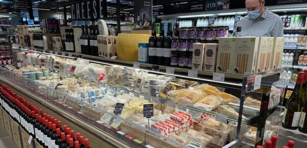
I’ve written about secondary locations before, and whoever designed this store may well have read that those articles. We’ve got a gorgeous display of wine and cheese (see below), barbecue firelighters with the steaks, coffee with the biscuits. There was mustard with the hams and quiches, chips with the dips, mayo with the pork pies and pasties. Possibly too much, but I’m still loving it!
Simple shopper language education
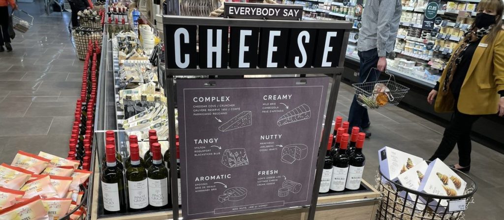
And if you happen to find all of this variety of cheese overwhelming, we’ve even got educational signage to explain a little about what these cheeses taste like. None of the complexity that some cheese brands go into. This isn’t all about origins and how many times the cows are massaged each day. This is simple shopper language. What does the cheese taste like. And answering two important shopper questions in one: “which cheese will I like?” and “why should I buy more than one?”
Turn a zero category into a hero category
 As I have shared a number of times, the future of retail requires that multi-category retailers have to make some choices.
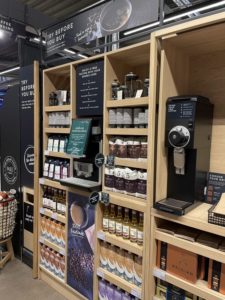
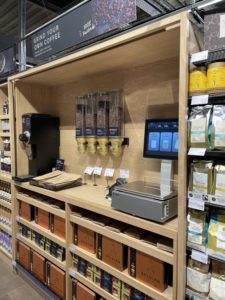 Doing an average job of every category doesn’t work for the fragmented shopper. Retailers have to decide which categories they want to win, and which are winnable. It’s clear that M&S have decided to win coffee.
Coffee has always been a relatively small category for this retailer (judging by the amount of space they used to give to it in store). But there has clearly been a decision to turn that around. Coffee is featured on a secondary location next to biscuits, a great way to drive a coffee which usually doesn’t get much traffic. But on the main fixture they have gone further. You can grind beans in the store (which is such a great, tactile, engaging shopper activity, plus it has the other benefit of flooding the store with gorgeous fresh coffee aromas. You can taste their coffee too: a coffee machine installed to give free samples, 24/7.
The future of retail needs sustainability
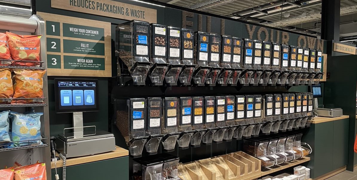
As we all know, sustainability is now high on everyone’s corporate agenda, and retailers are no exception. The future of retail will be sustainable stores and operations. M&S have a section of the store dedicated to zero packaging: with all sorts of products available from dispensers where you can use your own packaging or a paper bag provided by the store. In addition there are containers for recycling with a focus on things that currently can’t be recycled at home. There is also an understated plaque on the wall letting the shopper know that the entire M&S operation is carbon neutral.
And there’s more!
I haven’t mentioned the rotisserie station, selling fresh roasted chickens with the strategically placed baguettes bringing back just enough memories of vacations in Europe to make me want to take both home immediately. Or the in-store bakery. Or the sushi bar. Yes – this store is crammed full of stuff.
Does it all work? Of course not. I’ve already raised the challenge of balancing shopper interruption with aesthetics. There are places where signage blocks other signage when viewed from the shopper’s perspective. There are a few too many floor standing units that traffic flow was sometimes interrupted (probably not helped by me standing around taking photos either!) But there is another time and a place for those learnings (remember – subscribe!) For now I just want to marvel in one of the most shopper-centric stores I’ve seen for a long time.
Time for retailers and manufacturers to get shopper-centric and try something new!
At a time when it seems that the best some retailers can do to create shopper engagement is to put up video screens or shout about price, it is great to see a retailer really thinking about how they can win with shoppers by really engaging with them. I’m not suggesting every grocery store needs to go and install a sushi bar and a coffee grinder, but I do believe that retailers and brands can and must do more to work out what shopper want.
If you want to know more about how to engage shoppers to deliver better shopper engagement and better sales, get in touch now, or check out some of our training programs. Shoppers have more choice now about what they buy and where they buy it than ever in the history of consumer goods. What can you do to make sure they choose your brand or your store?
