Unlike my business partner Toby – I actually like shopping. Part of it is that I love a deal, and so whilst on this blog I frequently rail against the discount craziness that retailers and manufacturers conspire to create, I secretly love them. I actually feel I’m getting one over on “big businessâ€, which may or may not be true. But I love it.
And whilst Toby will call me a nerd because of my love of gadgets and all things electric, I’m not a big fan of online shopping either. Perhaps it is because most online shopping sites fail to deliver the wonderful personalization and experience that they offer, or maybe I’m just getting a little old fashioned in my dotage, but as long as I’m not in a rush and totally stressed out – I’ll take a real store any day. And whilst I sometimes have a habit of focusing on where shopper marketing fails to deliver, today I make a concerted effort to focus on a really great store experience, to show how I believe a store really can make a strategy fit, visibly, coherently, in a way that simply works. Today’s case study: Kiehl’s
I’m not big into the whole metro-sexual thing, but I am getting on, and so I do moisturize and try and undo what the excesses and travails of working across borders does to my body. Kiehl’s won my heart and my dollar, not just with great product, but because their store experience is brilliantly thought through.
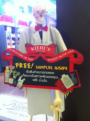
Get them into the store.
This sign is just outside the store (which in this case is in a shopping mall in Bangkok, Thailand). Nothing says “come shop here†like “FREEâ€. In this case free samples. Skin care products are expensive so this is a great way of getting someone into the store, into the brand world, with a message which is both in tune with the inner bargain hunter in all of us, but with the skin care shopper in particular.
Grab my attention
This display is clear. I’m pretty sure what their offering and I’m sure you are, even if you don’t read Thai or somehow missed the huge “Vitamin C†lettering – using simple imagery but bringing the store to life with fruit! Great, simple and memorable. Notice the conical flask at the bottom of the picture? See the point below on brand consistency.
Break the shopper barrier, and use social in a meaningful way
Will it work? Will it destroy my skin on the eve of my biggest presentation/party/date? The barriers to switching a skin care brand are reasonably obvious. The solution for Kiehl’s is to use recommendations; not from celebrities who really don’t live in the same world of pollution and stress that I do; but from real people. Here they are taking comments and recommendations left by satisfied consumers on their website.
Address what stops shopping
The guys at Kiehl’s clearly are targeting people like me. I first ventured into this store about a year ago. I had about an hour to mooch around the store whilst my wife was up to something else. The only fetter on my freedom? My then six year old daughter, Ellis. Kiehl’s seem to understand that kids stop browsing, and will limit a shopper’s engagement in the environment. How can I try out samples, read the blurb, explore the whole range, immerse myself in the Kiehl’s experience with a child desperate to go play on iMacs in the nearby department store? Kiehl’s take the child off my hands with a simple little kid’s area (decorated by more customer testimonial in the form of polaroid photos). Ellis plays. I’m happy. I shop. I buy more. Kiehl’s are happy.
Brand consistency, consistently
Apologies for the poor quality of the photo, but the entire picture is brilliant. Everything fits. Khiel’s brings science to skin in its positioning. They don’t overdo it, but there is something clinical in the layout, (as well as vintage urban). Subtle insertions of petri dishes and microscopes make the point. Remember the flasks in the Vitamin C display? Different display, but consistent with the brand. The staff wear white lab coats; samples are stored in drawers behind the counter in the way that pharmacies would have stored products a hundred years ago.
Always selling on
The role of the store is to sell stuff. Simple as that. Yes we’re building brands, but we are always selling. And selling on. You always get a free sample at Kiehl’s. It’s a feel good last touchpoint (how many service providers screw things up at the last moment?) ; and of course it is selling on. Assuming my experience of what I’ve bought is great; and the sample doesn’t miss the mark, the next time I come back, I might just try buy two products, or a whole system. After all, I’ll have time to browse whilst Ellis hangs out at the back of the store.
Winning at retail isn’t complicated. Thinking about the shopper is what matters. What will get them in the store, what will keep them in-store. What will engage them quickly and what will keep them engaged? What are the barriers that will prevent the shopper shopping, and how can they be addressed? And how do we make sure they come back again? And all the time, always, what is my brand about and how do we stay consistent across the entire marketing mix, be it display, staff, kid’s corner, or selling tactics?
Do you have any examples of stores, or shopper marketing campaigns that just work really well? Please feel free to share.
