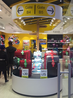
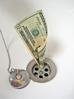
 The industry spends a huge amount of money trying to influence shoppers. Unfortunately, much of that is spent on discounts. Nowhere is this more true than in Turkey. I visited Istanbul for the launch of engage Turkey & Middle East recently. Shop after shop, the first thing that I saw as a shopper was a discount sign. And then I found one small store, tucked away in a corner of a shopping mall, that was a little different. Yes, they are using discounts, but they aren’t relying on discounts and discounts alone to win with shoppers. On the surface, they aren’t doing anything complicated either. Using retail design to win with shoppers requires a clear understanding of how shoppers shop, and what prevents them from buying. The thinking and the insights might be clever, but the actual execution is often quite simple.
Use smart retail design to make the store tell a story
It might sound obvious, but as most stores I visit are nondescript, I’m going to risk stating the obvious. Brand the store, make it mean something. Luggage isn’t a sexy category. I’d guess that the suitcase is the least exciting part of any trip. So what does this shop do? The first thing a shopper sees on entering this store is YELLOW – that’s different. That’s bright, uplifting, and suddenly the store doesn’t feel like a luggage store. It feels like a holiday store. And its not just color, either. The evocation of the holiday experience continues with the clever mimicry of airport signage, inspiring and bringing the idea of holiday to an otherwise mundane shopping experience.
Use retail design to help shoppers navigate unfamiliar environments
What I love about this store is that they don’t get carried away with the theme and the brand. They don’t let the brand or the idea get in the way of the shopping process. Instead they allow the theme to help shoppers. For many shoppers, navigating stores can be difficult, particularly if the shopper visits the store only rarely. I can’t imagine there are many people who buy suitcases more than once a year, so navigation is key to this store. The central signage is therefore doubly valuable. Note it doesn’t directly navigate – it doesn’t tell you where to find anything. But it draws in the shoppers’ eyes, then shows the shoppers where to look. This isn’t a sign with information, it is an arrow pointing, and human eyes like to follow pointing arrows. They guide the eyes to the next piece of information.
Use smart retail design to help shoppers find what they want
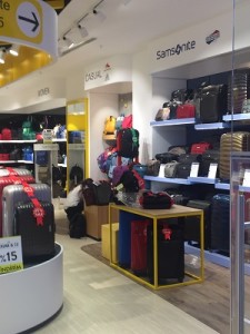
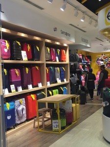 The signage above the fixture is too high to see up close, but that isn’t its role. Its signage from a distance. The central airport signage encourages a shopper’s eyes to look to the left or right and up – to see the signage and then understand where to go in the store. The signage is simple, and relevant to the shopper’s journey. Business or casual talks to consumer needs: The Samsonite sign pulls brand loyal shoppers. Again, this is nothing complicated, nor is it expensive.
Use insightful retail design to overcome shopper barriers
The kid’s section is visible from any part of the store and is sensibly positioned at the back of the store. Not just because this will pull traffic through the store as a child hurtles to check out the Disney gear at the back and parents are forced to follow. It also creates a relatively safe space for kids to linger while parents shop: something that wouldn’t be achieved had the kids section been positioned near the door. Anyone who has tried spending more than a few minutes in a store with a trailing, bored child, will see the value in that. So careful choice of location pulls shoppers deep into a store, allows a shopper to linger, and opens up the possibility of the shopper walking out with two bags (one for the child) instead of just one.
Good shopper insights often lead to simple execution
There is a lot of science that can go into retail design, and a lot of data and thinking can be done to optimize a shopping experience. At it’s heart is the need to understand shoppers, and that can be complicated. But the outcome doesn’t have to be complicated, difficult or expensive. Influencing shoppers is more about the gentle nudge, about smoothing the bumps on the purchase journey, and removing barriers to shopping and purchase. Sometimes simple is best! We’ve spent decades understanding shoppers, and how they shop: If you’d like to learn more, come and see us at one of our workshops.
